Last weekend, I stopped in to see a new show at the Hammer and was rewarded with not only a visually stimulating walk through the lobby, but the excellent news that Ammo has taken over the museum restaurant concession from Wolfgang Puck. Welcome Ammo at the Hammer…. What a great addition to Westwood! After seeing the excellent new show and taking a stroll around one of the city’s best gift shops, I was particularly happy to have made a choice to take an art-break.
Design – good or bad – is such a part of our visual landscape that it is easy to take for granted. The Hammer’s new exhibit, Graphic Design: Now in Production, in town until January 6, 2013 is organized by three cutting-edge art museums (the Walker Art Center, the Cooper-Hewitt, and the National Design Museum) and surveys the progress of design over the past decade. The eye-popper of a show is a reminder of how rapidly visual mores are changing in an age where anyone with a computer can become a producer of content. Graphic Design presents a great amount of eye candy, with a wee bit of historical perspective – one can’t help but what will happen to our visual language over the next ten years.
Some items in the exhibit are purely theoretical, but most of the items on display are easy for anyone in the family can appreciate — from the design innovations employed by the New York Times online team, to typography innovations in magazine and book design, to film and television title design. Design simplifies ideas, making symbols for our brains to comprehend more quickly and kids understand these notions on a very primal level, often more quickly than their parents. The innovations of some of the higher-end design firms are quite stunning (don’t miss the Casa da Musica exhibit for a highly intellectual logo and architecture design pairing for a Portuguese building).
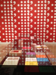
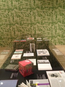
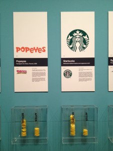
We loved seeing case after case of breathtakingly beautifully designed books, presented near large scale wall paper. But the part of the show that kids will most appreciate is an area that shows how designers have taken popular logos and updated their brands. Starbucks, Nickelodeon, Pfizer and other logos are shown before and after a re-branding and visitors can vote on which version they like better.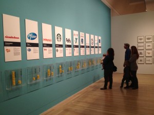
Although the upgraded versions of the designs are streamlined, visitors often voted for the original design — too much progress, too fast, perhaps? The exhibit reminded me of Logoquiz, a logo-identification app my teens obsessed over briefly this past summer.
Kids will get a kick out a machine that allows them to type words into a computer and have a poster made from the words. (The hole-punching machine only operates a few hours during the week). Perhaps this cute museum-goer might take the design world by storm herself, pushing Graphic Design ahead in the next ten years. 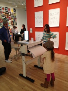
Kids can explore to their heart’s delight on December 9 at the Graphic Design Family Day. Click here for details.
And, really good news: Ammo is now at the Hammer. Delicious locavore favorite choice food for lunch — great for Westwood Village – so stop in for a taste after the show.
